
After a long, hectic day, we all love to retreat to our bedrooms—our personal havens. When you step inside, the worries of the day should melt away, replaced by a sense of tranquility and comfort.
The secret to this transformative experience? Your bedroom's perfect color palette.
Crafting a bedroom that feels like a soothing sanctuary involves many elements, but none are quite as impactful as the colors you choose. The right bedroom color scheme has the power to evoke a range of emotions, from serenity and relaxation to warmth and coziness. It can reflect your unique personality while also creating an ambiance that promotes better sleep and a more rejuvenating space.
So, whether you're looking to update your bedroom's look or you’re starting from scratch, join us as we explore the world of bedroom color schemes. Get ready to discover the hues that will transform your space into the ultimate personal oasis, tailored just for you!
The Importance of Selecting a Cohesive Color Scheme
While it may be tempting to randomly select colors you like for your bedroom walls, bedding, and accents, a more strategic approach can yield far better results. By thoughtfully choosing a cohesive color palette, you can create a bedroom that feels harmonious, inviting, and reflective of your personal style.
A well-planned color scheme not only creates a sense of balance and unity within the room but also evokes a specific mood or atmosphere. Whether you're aiming for a calming and restful vibe or a more energizing and vibrant feel, the right color combination can help you achieve your desired ambiance. Additionally, a cohesive palette can serve as a guide for all your decorating decisions, making it easier to select furniture, accessories, and decor items that complement each other seamlessly.
To choose a bedroom color scheme you'll love, consider:
- your personal preferences,
- the overall style you want to achieve, and
- the practicalities of your space, such as its size, layout, and natural light.
By keeping these factors in mind and exploring different color combinations, you'll be well on your way to creating a bedroom that feels like a true sanctuary.
Choose Your Mood
Before you make any color choices, first consider the atmosphere you want to create in your space. Colors have a strong influence over our mood, so understanding color psychology will help set you up for success from the very start.
Colors have inherent emotional connections, whether we consciously realize it or not. Blue, for example, is tied to feelings of relief and calm, while green is linked to contentment. Pink and red are associated with love, while black is tied closely to sadness.
If you want a calm, relaxing, and rejuvenating space, consider keeping your color palette in the cool color family with shades of blue, green, and purple. For a more vibrant and stimulating space, on the other hand, look to yellow and orange hues. You can also mix and match to curate your own selection.
Pick Your Primary Color First
Once you’ve identified the mood you want to create in your bedroom, choose your primary color. This will likely be the color you use to paint the walls, but it may also be used in other ways, like for bedding or other textiles.
Consider several factors when selecting the primary color, such as the saturation, undertones, and brightness. Before committing, we recommend choosing a few colors and sourcing swatches or samples to view them in your space. The lighting and time of day can majorly impact how a color looks, so see how it looks on your walls before jumping into a decision.

Consult the Color Wheel
After you choose your primary color, you’ll want to select a few complementary colors to round out your bedroom color scheme. There are two main directions you can go with your color palette: a monochromatic or complementary color scheme.
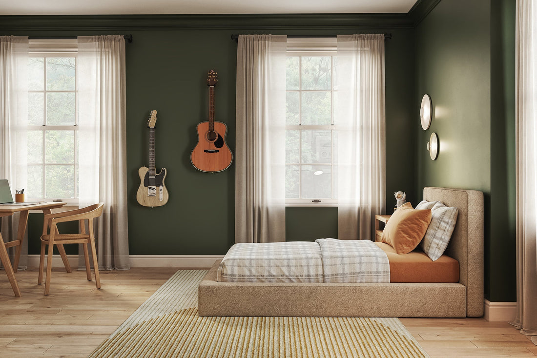
A monochromatic scheme requires picking colors that are all within the same color family. If you chose navy as your primary color, for example, adding sky blue, dusty blue, or even teal to your palette would create a dimensional, monochromatic blue color palette. This approach is often considered a more subtle and calming color scheme, making it a common option for bedrooms.
Complementary color schemes, on the other hand, require choosing colors opposite of your primary color on the color wheel. Orange, for example, is opposite to blue on the color wheel, so you would want to pick a rusty, burnt orange color to contrast with navy.
Once you’ve chosen your primary and accent shades, round out your palette with one or two neutral, secondary colors like white, gray, or brown. This will allow you to create a multidimensional palette with depth and warmth—instead of one that falls a bit flat.
Can’t pick your favorite color? Take our quiz to find your ideal SoftFrame® Designs bedroom setup!
Don’t Forget About Accents
While your color palette will guide your decision-making when it comes to paint, furnishings, and decor, don’t forget to think outside the box now and then. Primarily using your color palette to decorate will keep things cohesive, but you don’t want to use only those shades — or your space will become a bit too predictable.
Incorporate metallic accents like silver or gold and organic textures like stone or natural wood that fall outside of your palette to give your space personality and depth. This will also make your bedroom feel more timeless, so you can create a space you’ll love for years to come.

Put It All Together
Once you’ve selected your hues, it’s time to bring it all together in your bedroom. Paint the walls, hang any wallpaper or window treatments, and refresh your bedding to complete your bedroom makeover.
Don’t forget that your furniture also plays a role in bringing your color scheme together. If you have a cool-toned palette, consider choosing furniture finishings that fall in the same color family. Metal, black, or white-washed wood will all elegantly blend with cool shades. For upholstered pieces like SoftFrame® Designs bed frames, consider selecting cool-toned upholstery as well. Airy and bright options like white linen or bouclé, or dark hues like Charcoal Gray and Onyx Black blend beautifully with blues and greens.
For warm color palettes, rich wood finishes like oak or cherry are the ideal complement. For your SoftFrame bed frame upholstery, opt for sandy shades like Dune or Toast to bring a natural, organic hue to your bedroom. If you’re looking for more of a statement piece, you can also explore the SoftFrame Designs® Kids Collection with shades like light pink Cotton Candy, beautiful Sky Blue, or dark Forest Green.